

How Color Theory Impacts Interior Render Appeal
Color is an integral aspect of our lives. It influences our emotions, actions, and how we respond to various people, things and ideas. Much like in fashion, the world of architecture and interior design also heavily relies on color for communication, mood setting and aesthetic appeal. This blog post will explore how color theory plays a crucial role in enhancing the appeal of interior renders.
Understanding Color Theory
Before delving into how color theory impacts interior design, it is vital to understand what color theory is. In the simplest terms, color theory is a conceptual framework used to explain the relationships and interactions between colors.
The Basics of Color Theory
Color theory begins with the color wheel, which is a circular diagram of colors arranged by their chromatic relationship. It comprises primary colors (red, blue, and yellow), secondary colors (created by mixing primary colors), and tertiary colors (created by mixing primary and secondary colors).
Color Harmonies
Color harmonies, or color combinations, are a significant part of color theory. They involve combining colors in visually appealing ways. There are several types of color harmonies, such as complementary, analogous, and triadic, each creating a different mood and visual experience.
The Influence of Color Theory on Interior Render Appeal
Color theory is not just a scientific concept; it has practical applications in everyday life, particularly in interior design and rendering. The colors chosen for a room can dramatically affect its look and feel, influencing how people perceive and interact with the space.
Creating a Mood with Colors
Colors have the power to evoke emotions and create a specific mood. Warm colors like red, orange, and yellow can make a space feel cozy and stimulating, while cool colors like blue, green, and violet tend to create a calming and relaxing atmosphere. By understanding these effects, interior designers can use color theory to create spaces that promote desired emotional responses.
Enhancing Spatial Perception
Color can also affect how we perceive space. Light colors can make a small room seem larger, while dark colors can make a large room feel more intimate and cozy. By skillfully applying color theory, designers can manipulate spatial perception to achieve a desired effect.
Understanding the Basics of Color Theory in Interior Rendering
The Color Wheel and Interior Design
The color wheel, a basic tool for combining colors, plays a significant role in interior design. The color wheel consists of three categories: primary (red, yellow, and blue), secondary (mix of primary colors), and tertiary (mix of primary and secondary colors). Interior designers utilize the color wheel to create a balanced, harmonious color scheme in a room. For instance, complementary colors (opposite on the color wheel) can create a vibrant look, while analogous colors (next to each other on the wheel) can create a serene and comfortable design.
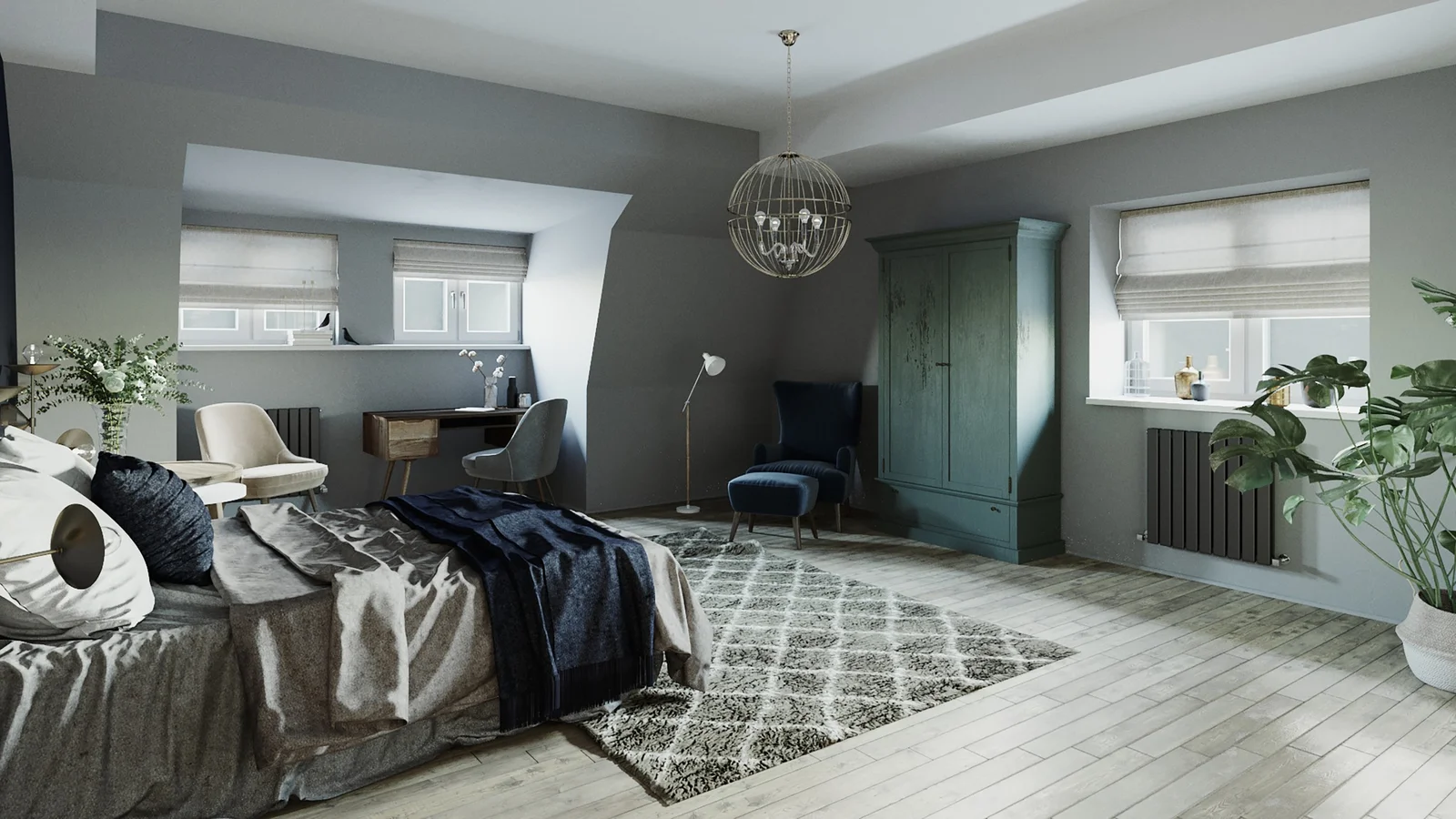
Role of Warm and Cool Colors in Interior Rendering
Warm colors, like red, orange, and yellow, make a room feel cozy and intimate, and are often used in living and dining areas. On the other hand, cool colors, such as blue, green, and purple, offer a calming effect and are ideally used in bedrooms and bathrooms. Understanding how warm and cool colors impact the mood of a space can greatly enhance the overall interior render appeal.
Color Theory Concepts Applied to Interior Renders
Monochromatic Color Scheme in Interior Design
A monochromatic color scheme involves the use of one color in varying shades. This scheme can create a harmonious and visually appealing interior render. By using tints, shades, and tones of a single color, designers can create a sophisticated and balanced space. Despite being one color, the variation in shades prevents the design from becoming monotonous.
Triadic Color Scheme in Interior Rendering
A triadic color scheme involves three colors that are evenly spaced on the color wheel. This scheme can bring a vibrant and lively mood to a room. However, it’s essential to balance the colors well, usually by allowing one color to dominate and using the other two for accent. Understanding how to effectively use a triadic color scheme can significantly impact the interior render appeal.
The Impact of Color Psychology on Interior Render Appeal
Emotional Impact of Colors in Interior Design
Colors have a psychological impact on people’s emotions and behavior. For instance, red can evoke feelings of love or anger, blue can induce calmness or sadness, and yellow can suggest happiness or anxiety. Knowing how different colors can affect people’s emotions can help designers create a room that not only looks good but also feels right.
Cultural Significance of Colors in Interior Rendering
Different cultures perceive colors differently. For example, while white signifies purity and innocence in Western cultures, it represents death and mourning in some Eastern cultures. Understanding these cultural nuances can significantly impact the appeal of an interior render, especially when designing for a specific demographic or geographic location.
Understanding the Basics of Color Theory in Interior Rendering
The Color Wheel and Interior Design
The color wheel, a basic tool for combining colors, plays a significant role in interior design. The color wheel consists of three categories: primary (red, yellow, and blue), secondary (mix of primary colors), and tertiary (mix of primary and secondary colors). Interior designers utilize the color wheel to create a balanced, harmonious color scheme in a room. For instance, complementary colors (opposite on the color wheel) can create a vibrant look, while analogous colors (next to each other on the wheel) can create a serene and comfortable design.
Role of Warm and Cool Colors in Interior Rendering
Warm colors, like red, orange, and yellow, make a room feel cozy and intimate, and are often used in living and dining areas. On the other hand, cool colors, such as blue, green, and purple, offer a calming effect and are ideally used in bedrooms and bathrooms. Understanding how warm and cool colors impact the mood of a space can greatly enhance the overall interior render appeal.
Color Theory Concepts Applied to Interior Renders
Monochromatic Color Scheme in Interior Design
A monochromatic color scheme involves the use of one color in varying shades. This scheme can create a harmonious and visually appealing interior render. By using tints, shades, and tones of a single color, designers can create a sophisticated and balanced space. Despite being one color, the variation in shades prevents the design from becoming monotonous.
Triadic Color Scheme in Interior Rendering
A triadic color scheme involves three colors that are evenly spaced on the color wheel. This scheme can bring a vibrant and lively mood to a room. However, it’s essential to balance the colors well, usually by allowing one color to dominate and using the other two for accent. Understanding how to effectively use a triadic color scheme can significantly impact the interior render appeal.
The Impact of Color Psychology on Interior Render Appeal
Emotional Impact of Colors in Interior Design
Colors have a psychological impact on people’s emotions and behavior. For instance, red can evoke feelings of love or anger, blue can induce calmness or sadness, and yellow can suggest happiness or anxiety. Knowing how different colors can affect people’s emotions can help designers create a room that not only looks good but also feels right.
Cultural Significance of Colors in Interior Rendering
Different cultures perceive colors differently. For example, while white signifies purity and innocence in Western cultures, it represents death and mourning in some Eastern cultures. Understanding these cultural nuances can significantly impact the appeal of an interior render, especially when designing for a specific demographic or geographic location.